0-1 Context Navigation Tool,
0-1 Context Navigation Tool,
0-1 Context Navigation Tool,
GitLab
GitLab
Timeline
3 months
Role
Product Designer
Team
1 Project Manager, 2 UX Researchers
Skills
User Research & Analysis, Interaction Design
Timeline
5 months
Skills
Interaction Design, Visual Design, UX Research, Systems Thinking, Design Systems
Timeline
5 months
Role
Solo Product Designer
Team
1 Project Manager, 1 Tech Lead, 10 Developers

OVERVIEW
About GitLab and the project
GitLab is an AI-powered DevSecOps Platform that supports the full software development lifecycle in a single application.
Issues are a core building block in GitLab that enable collaboration, discussions, planning and tracking of work.
Over 3 months, me and the team collaborated with GitLab UX team to tackle the challenge of reimagining how software members can get onboarded onto new issues faster without hassle.

THE PROBLEM
Finding critical project decisions in GitLab is unnecessarily difficult
Important decisions are buried across lengthy issue threads, forcing software teams to spend valuable time reconstructing context before they can move work forward.
Finding critical project decisions in GitLab is unnecessarily difficult
GitLab's issues are the source of truth for software teams. But as projects scale, important decisions become buried among hundreds of comments, making it difficult for teams to maintain alignment.


THE SOLUTION
Project decisions are now surfaced when teams need them most
I designed a scalable navigation system that surfaces key decisions directly within GitLab issues, allowing teams to quickly rediscover important context without rereading entire discussions.
Surface critical decisions without manually searching lengthy discussions.
Jump directly to the conversations behind key decisions
IMPACTS
85%
85%
85%
of user testers would recommend the feature to a colleague
4.3/ 5
4.3/ 5
4.3/ 5
Average ease of use score on the final prototype
RESEARCH
Researching pain points and understanding user rationales
We conducted internal audit of the GitLab issues and scheduled interviews with 10 GitLab users we recruited with the help of GitLab team.
Goal:
Understand user workflow and onboarding process.

Interviewee Screening
Interviewee Screening
Interviewee Screening
10 user interviews. This covered both internal and external GitLab users, enabling us to gather a wider range of context.

All of our sorted insights
RESEARCH -> PROBLEM FRAMING
Consolidating research insights into affinity mapping, we uncovered the two pathways we could move forward…
Navigation Issue
there was complexity in navigation which was due to scanning through links, code files, other issues, and even people to get further clarification from
How Might We …
make it easier for users to see the most relevant discussion comments?
Lack of context and too much information
The issue’s context was often unclear, its connection to broader project goals wasn’t obvious, and descriptions lacked updated information. Long discussion threads and pages made it harder to find key context.
How Might We …
make it easier for users to see the most relevant discussion comments?
WHO WE ARE DESIGNING FOR
Meet John - our representative user
Based on the collected insights, I created a persona to help guide the design and development strategy.

DESIGN EXPLORATION - CONCEPT TESTING
After ideating different solutions with the team through our Crazy 8 Exercise, we tested with users and selected 2 most promising concepts that align the most with our user values and scenarios.
Hearing the user challenges through interviews and our feedback loop helped me justify the decision (with good confidence) to push for a high-impact, high-effort feature.
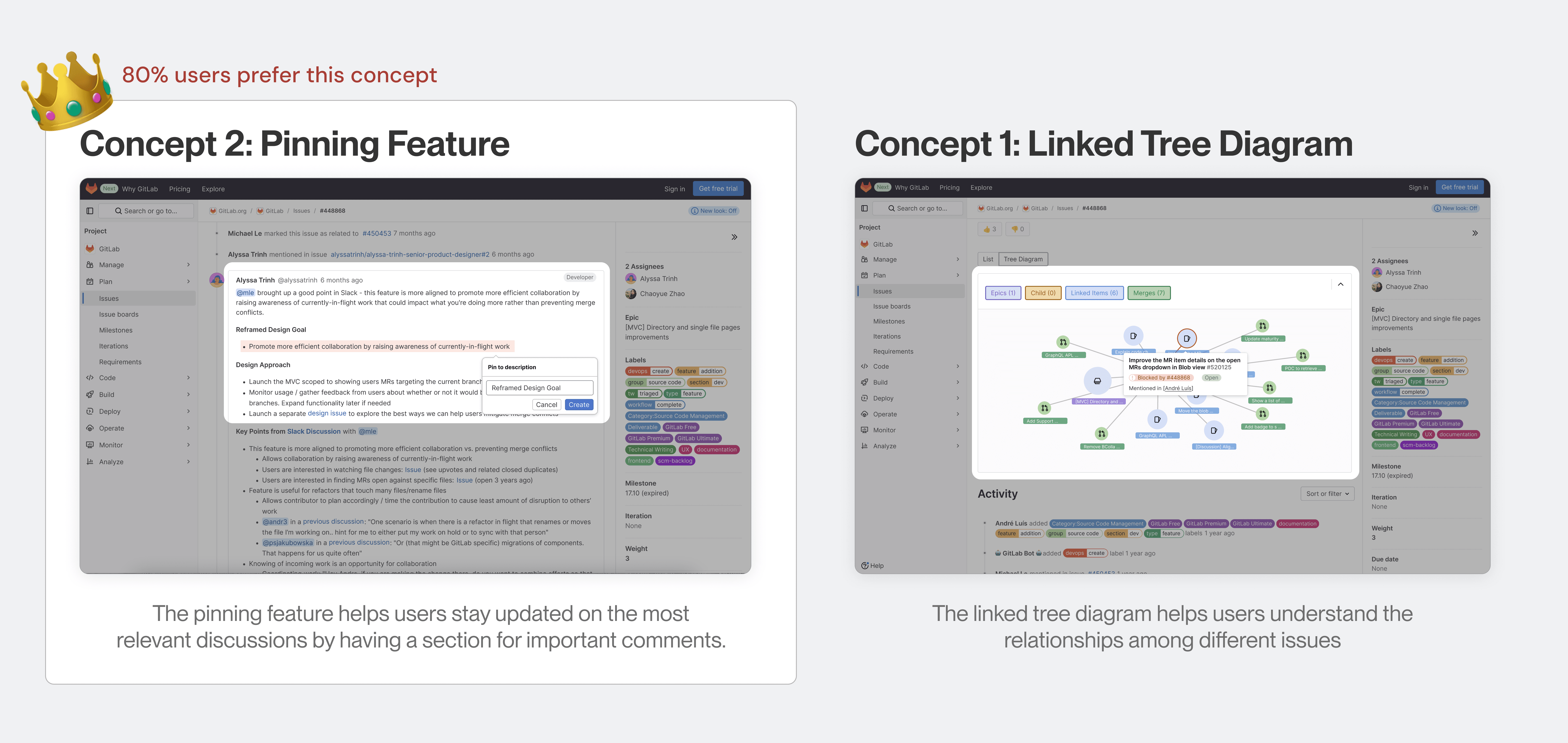

User feedback to justify the decision
DESIGN ITERATIONS AND A/B TESTING
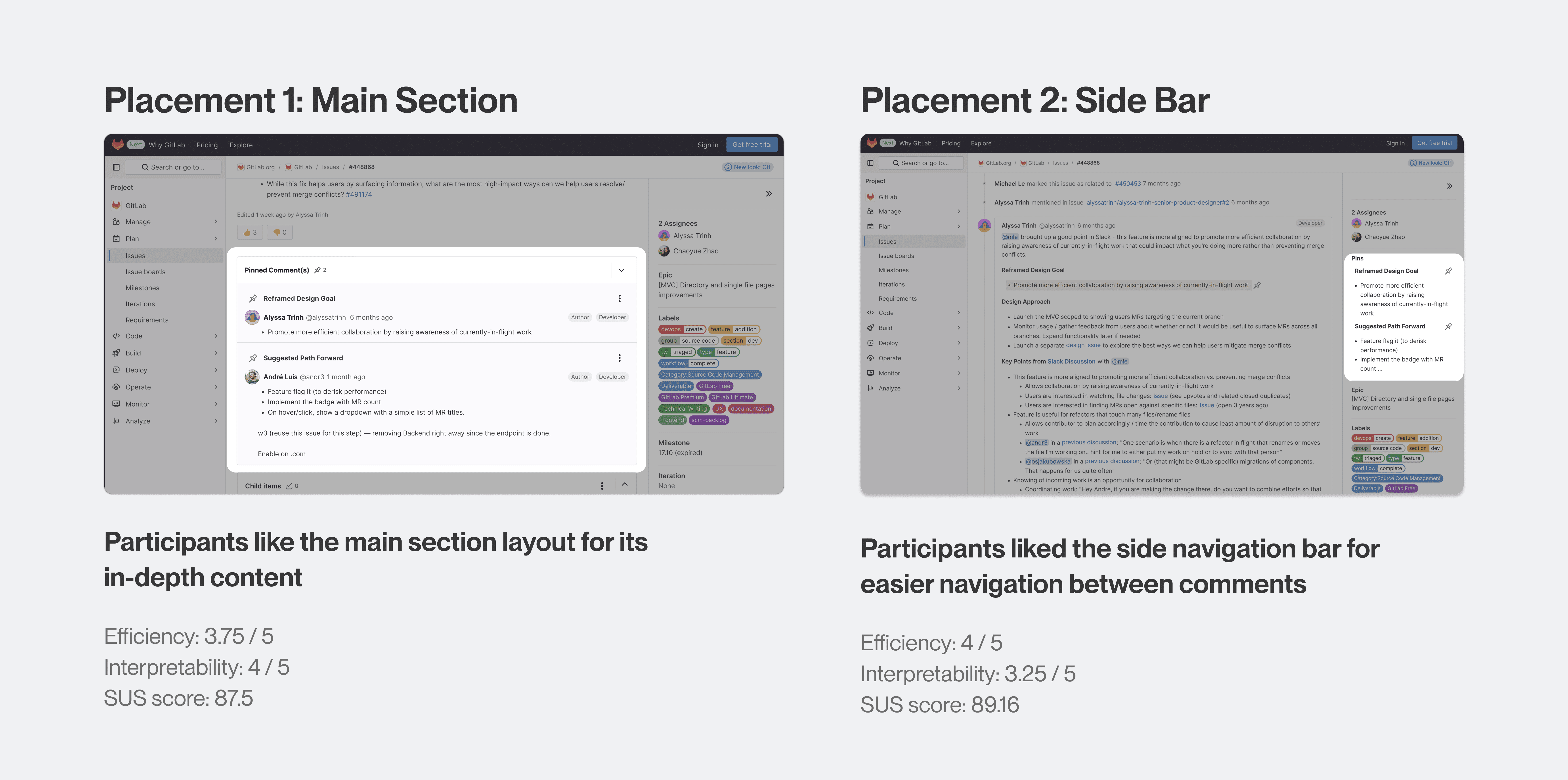
Where is the best location for the feature?
Our team ran an A/B test to determine whether the pinning tool should live in the main section or the sidebar, but results were inconclusive. As the lead designer, I explored a hybrid approach that combines both patterns into a single final design.
THE NITTY GRITTY PIXEL PERFECT DETAILS
With the main design challenges resolved, the next step was refining the finer details like copy, colors, technical feasibility, and interactions to ensure clarity and usability for GitLab users. This was done in close collaboration with GitLab team.

Some design questions I went through
INTERACTION DESIGN CONSIDERATIONS
Limiting the number of pins
We wanted to surface important decisions while avoiding pin fatigue caused by having too many pinned comments, which would defeat the feature purpose. Through user testing, I found that 5 pins was the sweet spot, helping ensure discussions remain clear, focused, and easy to scan.

BALANCING TECHNICAL FEASIBILITY
Navigating engineering pushback
Engineering feedback revealed that pinning individual discussion sections was too complex for the MVP. Therefore, I redesigned the feature to pin entire comment threads, leaving granular pinning for future iterations.
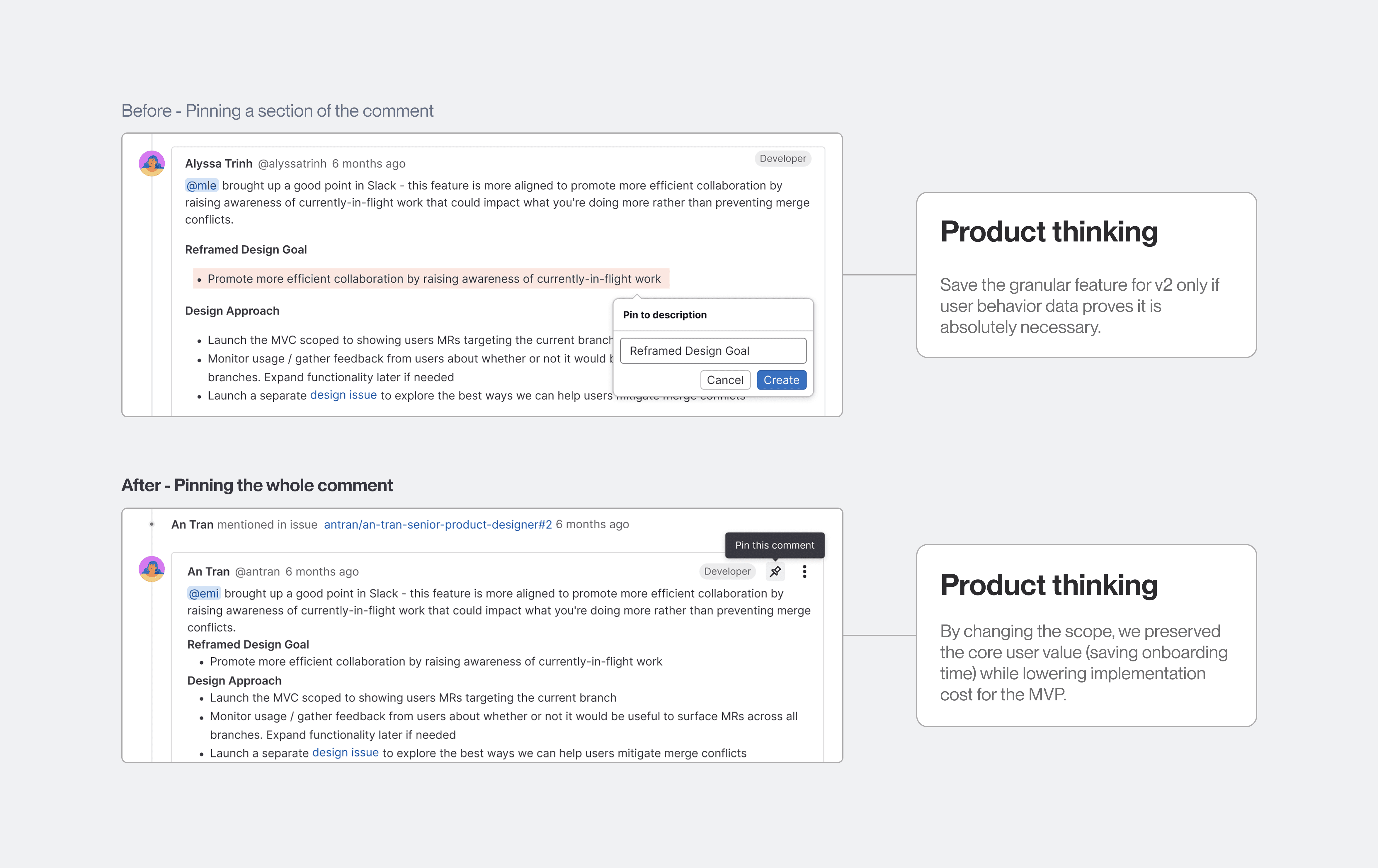
Interaction change
HIGHER LEVEL DESIGN FLOW, EDGE CASES
Building a fallback experience
When I brought the concept to engineers for feedback, they uncovered a backend edge case where comments could fail to pin due to temporary system issues. I quickly designed a lightweight error state with clear copywriting, which my engineer could easily implement in minutes.
Failure State
KEY LEARNINGS
💻 Designing for technical users who are highly skeptical about AI adoption
Initially, we assumed that technical enterprise users would be more receptive to AI-driven features, such as AI-generated summaries, because they were already accustomed to working within a highly technical platform. However, validating this assumption through mixed-method user interviews revealed a more nuanced perspective: technical users were not necessarily more willing to adopt AI simply because they were technically proficient.
🤔 Balances exploration with real-world constraints
As designers, it's easy to get carried away during ideation. But I learned product design is ultimately grounded in technical implementation. The best solutions balance creativity with feasibility, so understanding engineering constraints early helps ensure ideas are practical, scalable, and worth the development investment.
🧑🏻🎨 Getting into nitty gritty visual design
Through this project, I was able to delve into the finer details of visual design - spacing, typography, color - and intentionally crafted solutions that balance usability and adherence to existing design systems. I also realized how even the smallest design changes can have significant effects on the overal user experience.
Thanks to my GitLab team for a successful collaboration!



0-1 Context Navigation Tool,
0-1 Context Navigation Tool,
0-1 Context Navigation Tool,
GitLab
GitLab
Timeline
3 months
Role
Product Designer
Team
1 Project Manager, 2 UX Researchers
Skills
User Research & Analysis, Interaction Design
Timeline
5 months
Skills
Interaction Design, Visual Design, UX Research, Systems Thinking, Design Systems
Timeline
5 months
Role
Solo Product Designer
Team
1 Project Manager, 1 Tech Lead, 10 Developers
OVERVIEW
About GitLab and the project
GitLab is an AI-powered DevSecOps Platform that supports the full software development lifecycle in a single application.
Issues are a core building block in GitLab that enable collaboration, discussions, planning and tracking of work.
Over 3 months, me and the team collaborated with GitLab UX team to tackle the challenge of reimagining how software members can get onboarded onto new issues faster without hassle.
THE PROBLEM
Finding critical project decisions in GitLab is unnecessarily difficult
Important decisions are buried across lengthy issue threads, forcing software teams to spend valuable time reconstructing context before they can move work forward.
Finding critical project decisions in GitLab is unnecessarily difficult
GitLab's issues are the source of truth for software teams. But as projects scale, important decisions become buried among hundreds of comments, making it difficult for teams to maintain alignment.
THE SOLUTION
Project decisions are now surfaced when teams need them most
I designed a scalable navigation system that surfaces key decisions directly within GitLab issues, allowing teams to quickly rediscover important context without rereading entire discussions.
Surface critical decisions without manually searching lengthy discussions.
Jump directly to the conversations behind key decisions
IMPACTS
85%
85%
85%
of user testers would recommend the feature to a colleague
4.3/ 5
4.3/ 5
4.3/ 5
Average ease of use score on the final prototype
RESEARCH
Researching pain points and understanding user rationales
We conducted internal audit of the GitLab issues and scheduled interviews with 10 GitLab users we recruited with the help of GitLab team.
Goal:
Understand user workflow and onboarding process.
Interviewee Screening
Interviewee Screening
Interviewee Screening
10 user interviews. This covered both internal and external GitLab users, enabling us to gather a wider range of context.
All of our sorted insights
RESEARCH -> PROBLEM FRAMING
Consolidating research insights into affinity mapping, we uncovered the two pathways we could move forward…
Navigation Issue
there was complexity in navigation which was due to scanning through links, code files, other issues, and even people to get further clarification from
How Might We …
make it easier for users to see the most relevant discussion comments?
Lack of context and too much information
The issue’s context was often unclear, its connection to broader project goals wasn’t obvious, and descriptions lacked updated information. Long discussion threads and pages made it harder to find key context.
How Might We …
make it easier for users to see the most relevant discussion comments?
WHO WE ARE DESIGNING FOR
Meet John - our representative user
Based on the collected insights, I created a persona to help guide the design and development strategy.
DESIGN EXPLORATION - CONCEPT TESTING
After ideating different solutions with the team through our Crazy 8 Exercise, we tested with users and selected 2 most promising concepts that align the most with our user values and scenarios.
Hearing the user challenges through interviews and our feedback loop helped me justify the decision (with good confidence) to push for a high-impact, high-effort feature.
User feedback to justify the decision
DESIGN ITERATIONS AND A/B TESTING
Where is the best location for the feature?
Our team ran an A/B test to determine whether the pinning tool should live in the main section or the sidebar, but results were inconclusive. As the lead designer, I explored a hybrid approach that combines both patterns into a single final design.
THE NITTY GRITTY PIXEL PERFECT DETAILS
With the main design challenges resolved, the next step was refining the finer details like copy, colors, technical feasibility, and interactions to ensure clarity and usability for GitLab users. This was done in close collaboration with GitLab team.
Some design questions I went through
INTERACTION DESIGN CONSIDERATIONS
Limiting the number of pins
We wanted to surface important decisions while avoiding pin fatigue caused by having too many pinned comments, which would defeat the feature purpose. Through user testing, I found that 5 pins was the sweet spot, helping ensure discussions remain clear, focused, and easy to scan.
BALANCING TECHNICAL FEASIBILITY
Navigating engineering pushback
Engineering feedback revealed that pinning individual discussion sections was too complex for the MVP. Therefore, I redesigned the feature to pin entire comment threads, leaving granular pinning for future iterations.
Interaction change
HIGHER LEVEL DESIGN FLOW, EDGE CASES
Building a fallback experience
When I brought the concept to engineers for feedback, they uncovered a backend edge case where comments could fail to pin due to temporary system issues. I quickly designed a lightweight error state with clear copywriting, which my engineer could easily implement in minutes.
Failure State
KEY LEARNINGS
💻 Designing for technical users who are highly skeptical about AI adoption
Initially, we assumed that technical enterprise users would be more receptive to AI-driven features, such as AI-generated summaries, because they were already accustomed to working within a highly technical platform. However, validating this assumption through mixed-method user interviews revealed a more nuanced perspective: technical users were not necessarily more willing to adopt AI simply because they were technically proficient.
🤔 Balances exploration with real-world constraints
As designers, it's easy to get carried away during ideation. But I learned product design is ultimately grounded in technical implementation. The best solutions balance creativity with feasibility, so understanding engineering constraints early helps ensure ideas are practical, scalable, and worth the development investment.
🧑🏻🎨 Getting into nitty gritty visual design
Through this project, I was able to delve into the finer details of visual design - spacing, typography, color - and intentionally crafted solutions that balance usability and adherence to existing design systems. I also realized how even the smallest design changes can have significant effects on the overal user experience.
Thanks to my GitLab team for a successful collaboration!