Date
Role
Skills
Team

TL;DR
The project at a glance
⎯⎯⎯
What is GitLab issue?
The Problem
THE CURRENT GITLAB ISSUE BOARD SLOWS DOWN DEVELOPER ONBOARDING
It is overwhelming to click through numerous ancestor links and understand how the current issue relates to other issues.
Endless scrolling …

What are the relationships between the blocking issues and related issues?
The Solution (demo)
A NEW WAY TO GATHER NEW CONTEXT
Let's backtrack a little
Validating the problem with research
⎯⎯⎯
Together with my team, I conducted 10 interviews with internal and external GitLab users
1.
It can take any time from a couple of minutes to days for users to fully understand the issue depending on the complexity

Austin, Staff Product Designer
2.
There are many hyperlinks/ ancestor links, so the user needs more time to find more context on previous issues
Alyssa, Product Designer
3.
When the project summary is not updated, it is hard to onboard onto an issue when there is little context or updates
Thomas, Staff Fullstack Engineer
Through affinity mapping, we group the problem areas into 3 main themes
Navigation
Lack of context
Information Overload
Which then came down to 2 paths moving forward
HOW MIGHT WE #1
HOW MIGHT WE #2
Problems defined, let's move on to…
Ideation and Testing
⎯⎯⎯
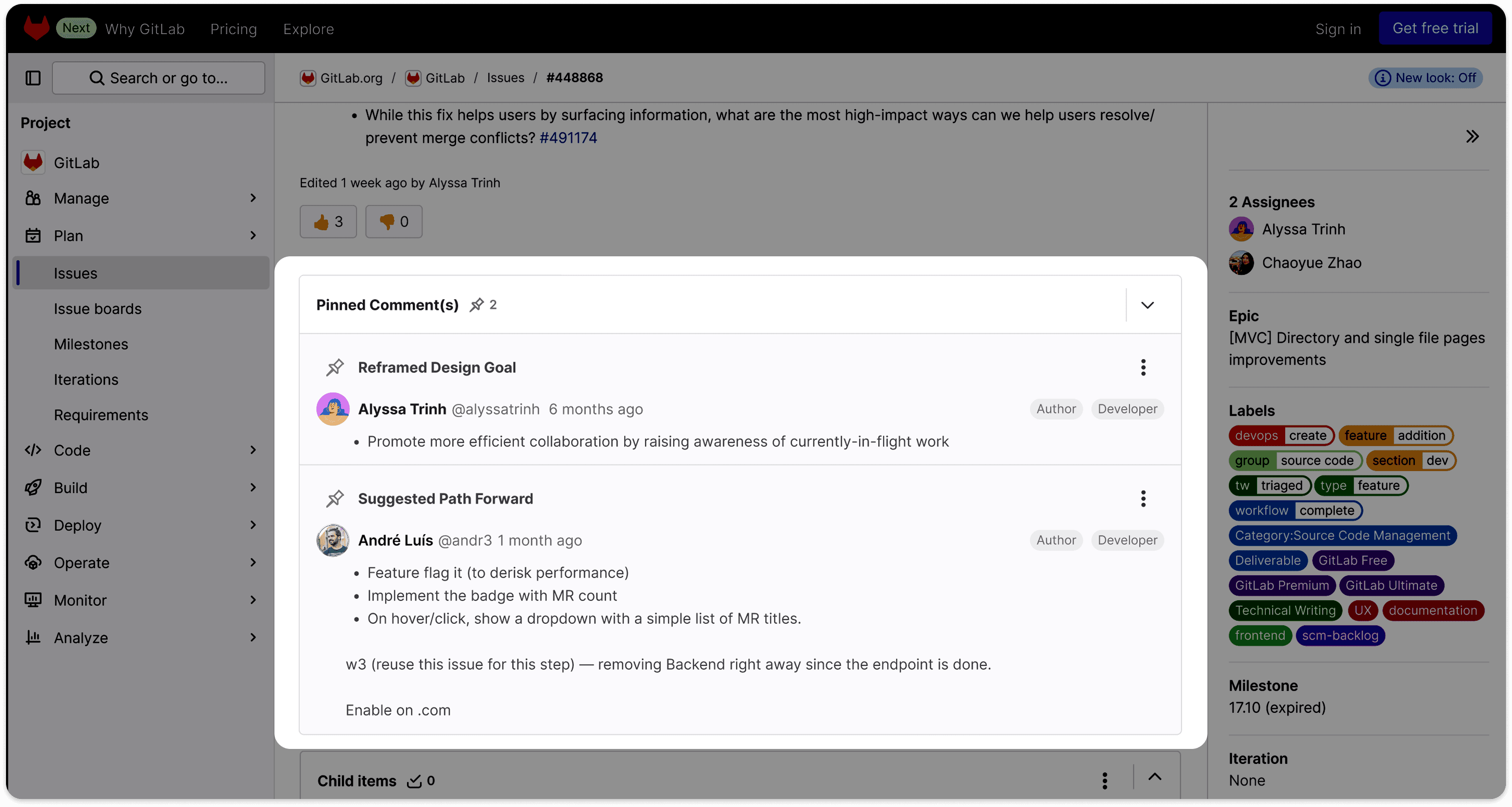
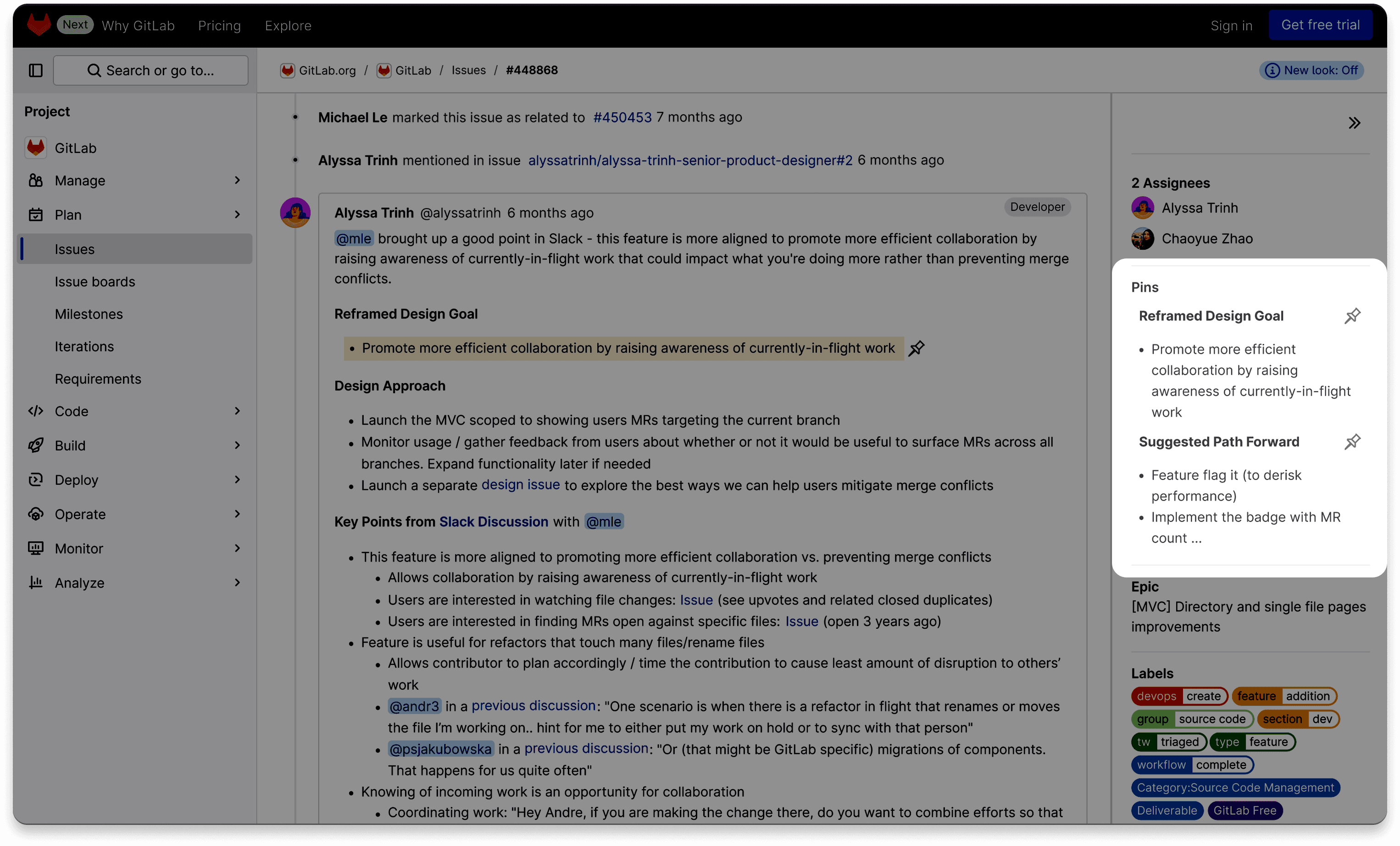
The pinning feature helps users stay updated on the most relevant discussions by having a section for important comments. Clicking a pin brings a user to the comment's origin in a discussion thread, providing an easier path for gaining context through these relevant discussions.
Through testing with internal and external GitLab users, 80% prefer the pinning feature!

External Gitlab User 1
"I can immediately see the highlights or the main problem for this issue, which I think is a very good feature that I would actually go and use."
External Gitlab User 2
"It just makes my life a lot more easier now I don't have to find those information, I can just directly find it from here and then either reach out to the person or take a deeper look at the issue from the section."
Problems defined, let's move on to…
Design Iterations and Testing
⎯⎯⎯
A/B Testing
Since there was a tie between two variations, I decided to combine the best of both worlds
But can we technically build this?
"Pinning a section of the comment would be technically complicated."
Gathering design inputs
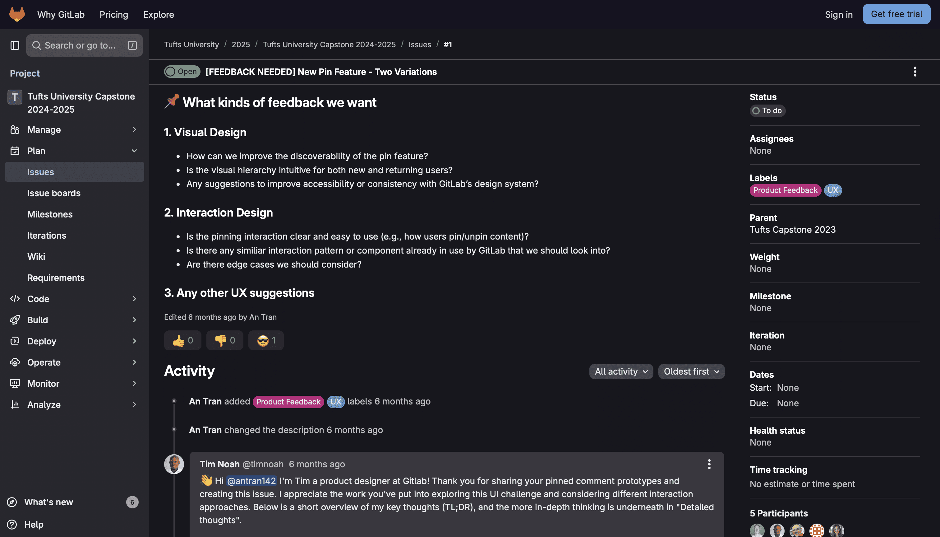
Given GitLab’s collaborative culture, I created a GitLab issue to facilitate design discussions with senior designers, gathering valuable inputs on visual and interaction design, alignment with the Pajamas design system, and key design decisions.
Introducing…
Final Design Concepts
⎯⎯⎯
Create A Pin
Edit/ Remove a Pin Title
Unpin
Outcome
The design concept pitch resurfaced a forgotten user pain point
⎯⎯⎯
Upon completing our pinning feature proposal, we discovered that a similar idea had been raised by GitLab’s internal team 6–8 years ago. However, it never made it to production due to shifting priorities and roadmaps. By revisiting this need through the lens of updated workflows, user interviews, and usability testing, we uncovered real-world pain points that many GitLab users are still facing while navigating long discussions. Our research has encompassed a variety of perspectives from internal and external stakeholders, while our design has been grounded in key user needs, observed patterns, and technical constraints. These can serve as a scalable solution for the GitLab team to consider in the long term.
Reflection…
What did I learn?
⎯⎯⎯
Designing for technical users
Before this project, I knew little about the developer workflow and GitLab's technical issues board. Working within a real-world system revealed just how nuanced technical workflows can be. By speaking with multiple users and validating my findings through research, I gained a deeper understanding of the GitLab user experience and navigated the complexity of a technical platform with more ease. Each user experiences the system differently depending on their role and how their company is set up.
Crafting research methodologies
With the support from the GitLab team, I learned how to determine which research methods aligned with project goals, clarify what data would drive meaningful decisions, and incorporate new tools (e.g., Dovetail, NotebookLM) to organize and analyze insights.

