Enhancing the Loyalty App for Vietnam's No.1 multi-category retail platform: How can we boost Monthly Active Users (MAU) and keep users engaged?

As my capstone project for the Impactful UX Practice Certificate offered by StayLab, I tackled a project brief from Mobile World Investment Corporation (MWG) - Vietnam's No.1 multi-category retail platform - to propose UX solutions for enhancing their Loyalty App, which serves 5M+ users across their ecosystem. Our goal was to understand why customers are not engaged and explore UX strategies to increase Monthly Active Users (MAU) on the platform using the 3M UX framework - Micro, Meso, and Macro (Kevin Corti, PhD - UX Research at Google).

In a team of 3 Product Designers, I led the team through heuristic evaluation, synthesizing findings using matrix, crafting user interview and usability testing plans, and proposing design changes.

Cover Image
Cover Image
Cover Image
Cover Image

Date

May 2024 - July 2024

Role

Product Designer

Teams

User Research, Usability Testing, Product Strategy, Interaction Design, Visual Design, Storyboarding

Team

3 Product Designers

What's MWG?

Mobile World Investment Corporation (MWG) is Vietnam's no 1 multi-category retail platform with 5,000+ stores nationwide. In MWG's ecosystem, besides the subsidiaries running retail chains, other subsidiaries are providing related services such as: last-mile delivery, logistics, warehousing services ...

Mobile World Investment Corporation (MWG) is Vietnam's no 1 multi-category retail platform with 5,000+ stores nationwide. In MWG's ecosystem, besides the subsidiaries running retail chains, other subsidiaries are providing related services such as: last-mile delivery, logistics, warehousing services ...

Mobile World Investment Corporation (MWG) is Vietnam's no 1 multi-category retail platform with 5,000+ stores nationwide. In MWG's ecosystem, besides the subsidiaries running retail chains, other subsidiaries are providing related services such as: last-mile delivery, logistics, warehousing services ...

Mobile World Investment Corporation (MWG) is Vietnam's no 1 multi-category retail platform with 5,000+ stores nationwide. In MWG's ecosystem, besides the subsidiaries running retail chains, other subsidiaries are providing related services such as: last-mile delivery, logistics, warehousing services ...

What's Qua Tang VIP (VIP Gifts)?

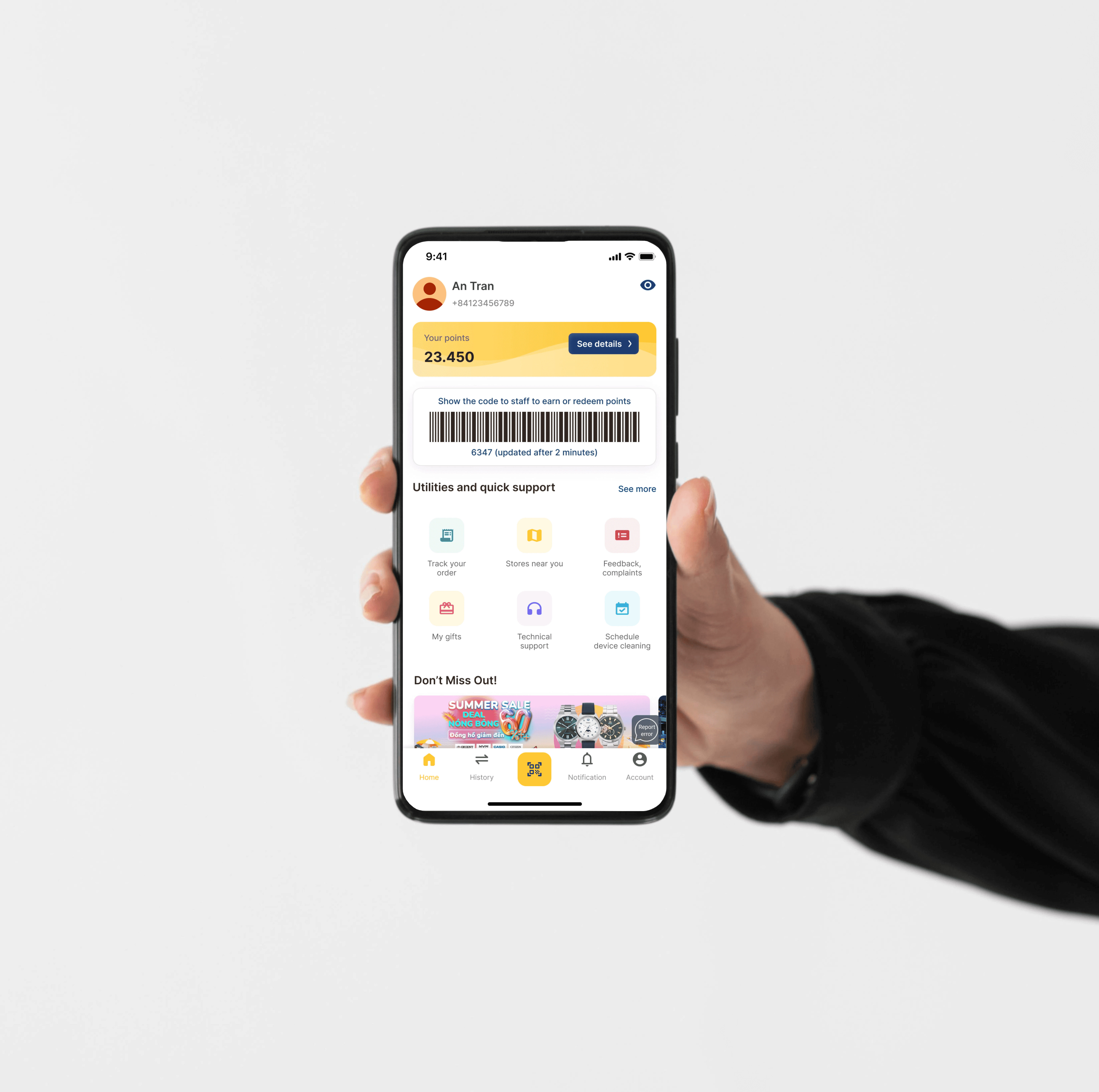
Quà Tặng VIP (VIP Gifts) is a Loyalty App through which the retail corporation MWG implements its vision of enhancing customer experience and satisfaction when shopping on its omni-channel system. On the VIP Gifts app, customers can:

  • Earn points for every purchase

  • Convert points into money

  • Manage and track orders, check warranty information and product maintenance

  • Access services such as scheduling cleaning appointments, finding nearby stores, etc.

The Problem

MWG's VIP Gifts Loyalty App is facing low user engagement, as only 10% of existing customers are actively participating in the loyalty program. Users struggle to understand the loyalty program's benefits, especially around point accumulation and redemption, often abandoning the app mid-way due to unclear instructions and cluttered interfaces.

The Solutions (Shhh… Sneakpeak 👀)

The redesign of the MWG Loyalty App improves engagement at three levels:

  • Micro: Focuses on moment-to-moment experiences, optimizing the homepage for easier navigation and access to key features.

  • Meso: Enhances user journeys, providing clearer information on point accumulation and redemption.

  • Macro: Strengthens long-term engagement with a newly proposed tiered loyalty program that rewards users for their continued use, increasing retention and Monthly Active Users (MAU).

Micro Level

Meso Level

Macro Level

Micro Level

Meso Level

Macro Level

Micro Level

Meso Level

Macro Level

Micro Level

Meso Level

Macro Level

⎯   ⋆˚✿˖ °𐙚 ⊹ ࣪ ˖ ᡣ𐭩   ⎯

But first, let's

Break down the problem space

⎯⎯⎯

From the business' POV

Before beginning the design, we sought to understand how the VIP Gifts Loyalty App can uniquely position MWG to lead the charge within Vietnam's competitive retail landscape.

📉 Market Analysis:

The Vietnamese retail sector is facing an unprecedented challenge, as consumer demand continues to decline in the beginning of 2024.

This signals a stagnation phase in Vietnam's retail market, particularly indicating a decline in in-store traffic and customer engagement with sales services.

Consumer demand for non-essential goods in Vietnam

(Source: Facebook Thong Do)

Consumer demand for non-essential goods in Vietnam

(Source: Facebook Thong Do)

Consumer demand for non-essential goods in Vietnam

(Source: Facebook Thong Do)

Consumer demand for non-essential goods in Vietnam

(Source: Facebook Thong Do)

💎 Opportunity:

This trend indicates a necessity for MWG to pivot toward digital channels, especially through its Loyalty platform, to support sales activities and increase revenue streams. By leveraging the platform as a key tool for customer engagement, MWG can strengthen customer loyalty and gain a competitive edge in the market, helping to navigate the challenges of declining in-store traffic.

🗂️ Product Lifecycle Analysis:

—————————————————————————————————————————————————-

—————————————————————

————————————————————————————————————————————

From the user's POV

📉 Problem framing

Upon receiving the project brief from stakeholders, we sought to gain a basic overview of the problems users are encountering by conducting desk research into user feedback from App Store/Google Play (36 reviews), along with stakeholder interviews.

Similar key pain points emerged from both sources, including:

Lack of user understanding 🔍

The primary reason users download and use the app is only for point accumulation, resulting in low retention and minimal exploration of other features.

Not user friendly

The app is not engaging enough for customers to remember to use it.

Design friction

The app's current design makes it hard for users to accumulate and use points, lowering satisfaction and reducing continued usage.

To guide our design process, the PM from PWG raised 3 objectives for us to tackle, including …

—————————————————————————————————————————————————-

—————————————————————

————————————————————————————————————————————

UX Audit

Based on 10 Usability Heuristics, we evaluated and conducted a comprehensive analysis of the current VIP Gifts app interfaces to identify design issues and usability concerns.

Rough work of our UX audit

—————————————————————————————————————————————————-

—————————————————————

————————————————————————————————————————————

User Interviews

We further conducted user interviews to validate the insights and assumptions we gained from desk research, stakeholder interviews, and heuristic evaluation.

Audience

6 users

  • Experimental group: Customers who have used the app but have deleted it.

  • Control group: Customers who frequently make purchases and accumulate points.

Lots of sticky notes during our open coding session

Key Insights

Users installed the app primarily for tracking earned points, though they lacked awareness of many secondary features.

Users faced challenges with the point redemption process due to its inconsistent interfaces.

—————————————————————————————————————————————————-

—————————————————————

————————————————————————————————————————————

Usability Testing

Next, we conducted tests with 5 first-time and infrequent users to better understand their behaviors and emotions. We then organized the insights into empathy maps to gain a comprehensive view of the pain points users are experiencing.

Goals

  • Explorative: Evaluate which features grab users' attention the most.


  • Start-to-end: To validate the assumption from previous research that users lack motivation to use the app because it is not easy to check accumulated points from previous purchases, and they don't understand how to use points → leading to frustration and a lack of trust in the system.

Preview of our Empathy Map

Key Insights

Users desired a simpler, more concise explanation of points accumulation and redemption.

Users are confused by the layout of the homepage.

Users skipped banner ads, preferring categorized deals to find relevant offers.

Users prefer other loyalty apps, since they don't find values in using MWG's app.

⎯   ⋆˚✿˖ °𐙚 ⊹ ࣪ ˖ ᡣ𐭩   ⎯

Secondly, we move on to…

Define the problems

⎯⎯⎯

Research Synthesis

Drawing from the raw feedback gathered during previous internal and external research, I led the team to carry out several exercises to synthesize the data, identify key insights, and convert them into valuable ideas to guide our next design process. Throughout the process, I also sought feedback from my design mentors to make sure we are on the right track.

Click through the slides to see each filtering round!

—————————————————————————————————————————————————-

—————————————————————

————————————————————————————————————————————

So, what did we discover?

After conducting our research and synthesizing the findings, we were able to refine our solution space and concentrated on HIGHT IMPACT - LOW EFFORT insights.

—————————————————————————————————————————————————-

—————————————————————

⎯   ⋆˚✿˖ °𐙚 ⊹ ࣪ ˖ ᡣ𐭩   ⎯

Problems defined, let's get down to…

Designing

⎯⎯⎯

Simplified Visual Language

Due to the limited bandwidth for accessing the internal design system, we opted for a simplified design system based on the branding guidelines. I also had the freedom to choose and design components as needed. This approach allowed for a streamlined and efficient design process while maintaining a clean and functional visual language.

—————————————————————————————————————————————————-

—————————————————————

Key Explorations

We went through many iterations within our team and based on feedback from our design mentors. For example, our first challenge was redesigning the homepage’s top bar to better communicate essential information. This included displaying the user’s total points, a personal QR code for point redemption, and an intuitive indicator for understanding point accumulation.

We explored two design options to convey the rules for accumulating points to users:

We did a rapid testing and went with option 3 since discoverability is critical for user understanding about point accumulation rules.

—————————————————————————————————————————————————-

—————————————————————

⎯   ⋆˚✿˖ °𐙚 ⊹ ࣪ ˖ ᡣ𐭩   ⎯

Final solution

Introducing the enhanced UX improvements

⎯⎯⎯

Learning from "Understanding the Micro, Meso, and Macro Worlds of User Experience" by Kevin Corti, PhD - UX Research at Google, we proposed UX solutions across 3 levels: Micro, Meso, and Macro. This approach ensures a systematic UX approach where every design interaction contributes meaningfully to the larger user experience ecosystem, no matter how small or big.

—————————————————————————————————————————————————-

—————————————————————

Micro

The Micro World of UX comprises moment-by-moment experiences: direct sensory and motor phenomena, tasks, tools, and decision-making moments users encounter when using a product to accomplish lower-order goals.

OPTIMIZED HOMEPAGE LAYOUT

The optimized homepage now features a more streamlined top bar, reducing its size for better scrolling ease, while adding a "Stores Near You" button for quick access. Additionally, banners have been categorized by brands for clearer promotions, making it easier to find relevant offers.

PREVIOUS SOLUTION

The old design had a large, fixed top bar that cluttered the screen and disrupted the scrolling experience. Users had to go through many steps to find "Stores Near You" and locate brand-specific promotions, increasing friction.

—————————————————————————————————————————————————-

—————————————————————

Meso

The Meso World of UX consists of user journeys: sequences of lower-order goals that form pathways toward higher-order goals.

CLEAR POINT ACCUMULATION INFORMATION

By clicking the 'See details' button of the top bar with users' points displayed, the user can see a detailed page about point accumulation categorized by brands, with each brand having specific rules. A new "How to Earn Points" and "Points History" buttons have been added, providing transparency on earning and tracking points.

PREVIOUS SOLUTION

Users struggle to understand how points are accumulated and what benefits they can receive. The point accumulation details are buried within cluttered promotional banners, making it difficult to find and understand the rewards system.

—————————————————————————————————————————————————-

—————————————————————

————————————————————————————————————————————

Macro

The Macro World of UX is the realm of user-product relationships: how users experience successive user journeys and how user segments orient toward products longitudinally.

TIERED LOYALTY PROGRAM

Customers can advance from Silver to Platinum status by reaching specific spending milestones, with each tier offering increasing benefits such as exclusive offers from stores within the MWG network. As customers move up the tiers by making frequent purchases, they unlock more valuable rewards and privileges.

OPPORTUNITY

By introducing a tiered loyalty program across the MWG ecosystem, we can directly address the business goal of improving MAU. Competitors already offer loyalty programs, and users have mentioned their interest in such features. Since we currently do not provide this, it presents a clear opportunity to enhance user engagement and retention through rewards and exclusive benefits.

Storyboard of our proposed macro feature

⎯   ⋆˚✿˖ °𐙚 ⊹ ࣪ ˖ ᡣ𐭩   ⎯

If we had more time…

Next steps and metrics we aim to measure

⎯⎯⎯

More usability testing

If I had more time, I would continue to gather user feedback and make improvements on v2 of our high-fi prototypes, gaining more insight into the features we made changes to.

Metric #1: Monthly Active Users (MAU) Rate

Track MAU metrics to see if the tiered program increases user engagement, especially those previously considered "low engagement" users.

Metric #2: User Satisfaction Rate

If these UX improvements are incorporated into real-life changes, we aim to conduct post-launch surveys to gauge user satisfaction with the new interfaces and improved user flows.

⎯   ⋆˚✿˖ °𐙚 ⊹ ࣪ ˖ ᡣ𐭩   ⎯

After one and a half month, I…

Reflect back on the progress and learn …

⎯⎯⎯

Designing with users and business in mind

During a short sprint, I learned to approach design decisions from multiple perspectives, including user experience, business goals, and technical feasibility. This holistic approach ensures that the product addresses user needs and aligns with broader business objectives and market positioning.

Applying 3M framework for product strategy proposal

The most valuable insight I gained is how to propose impactful UX solutions across three levels: Micro, Meso, and Macro (3M framework). One critical lesson I’ve learned is that increasing clarity and reducing risk as much as possible should be prioritized when dealing with ambiguity. This often involves breaking down complex problems through primary research and idea validation to guide effective decision-making.

Conducting effective UX research

Establishing clear goals and methodologies in a research plan is essential for effectively synthesizing findings and ensuring that insights align with the research purpose. By conducting pilot sessions with the team before engaging with real users, I learned to refine the right questions to ask and develop an unbiased question order that encourages genuine responses from users.
Capstone Presentation Day (that's me in the middle on the screen!)

A huge shoutout to my team and my mentors for guiding this project to success! 🏆

Capstone Presentation Day (that's me in the middle on the screen!)

A huge shoutout to my team and my mentors for guiding this project to success! 🏆

Next Project