
How did I get there?
I identified low engagement drivers through market and product lifecycle analysis.
⎯⎯⎯
From the business' POV
Market Analysis
Vietnam’s retail sector entered a challenging period in early 2024, with consumer demand continuing to decline. This signals a broader stagnation in the market, most notably reflected in reduced in-store foot traffic and lower engagement with sales staff.
What does this mean for UX?
MWG needs to focus on improving the in-store omnichannel experience. The app acts as a supporting tool, not the main product.
This means UX should take a product mindset - aligning design decisions with business goals and delivering measurable impact within current constraints.
The UX Goal
ENHANCING UX
How might we make the VIP Gifts App less confusing, more transparent, and more rewarding to encourage regular use?
I validated user confusion through heuristic evaluations and in-depth interviews

Secondary Research
Heuristic Evaluations
Stakeholder (PM) Interview
Competitor Analysis

Qualitative Research
In-depth User Interviews
Usability Testing
⭐️ Considering the business constraint of low UX maturity, I focus on high-impact, low-effort solutions, And to do that, I and the team went through four filtering rounds to synthesize the data:

Who are we designing for?

Problems defined, let's get down to…
Designing
⎯⎯⎯


As a lead product designer, I advocated for a clean, functional design library within existing brand constraints


Final solution
Introducing the enhanced UX improvements
⎯⎯⎯
Micro
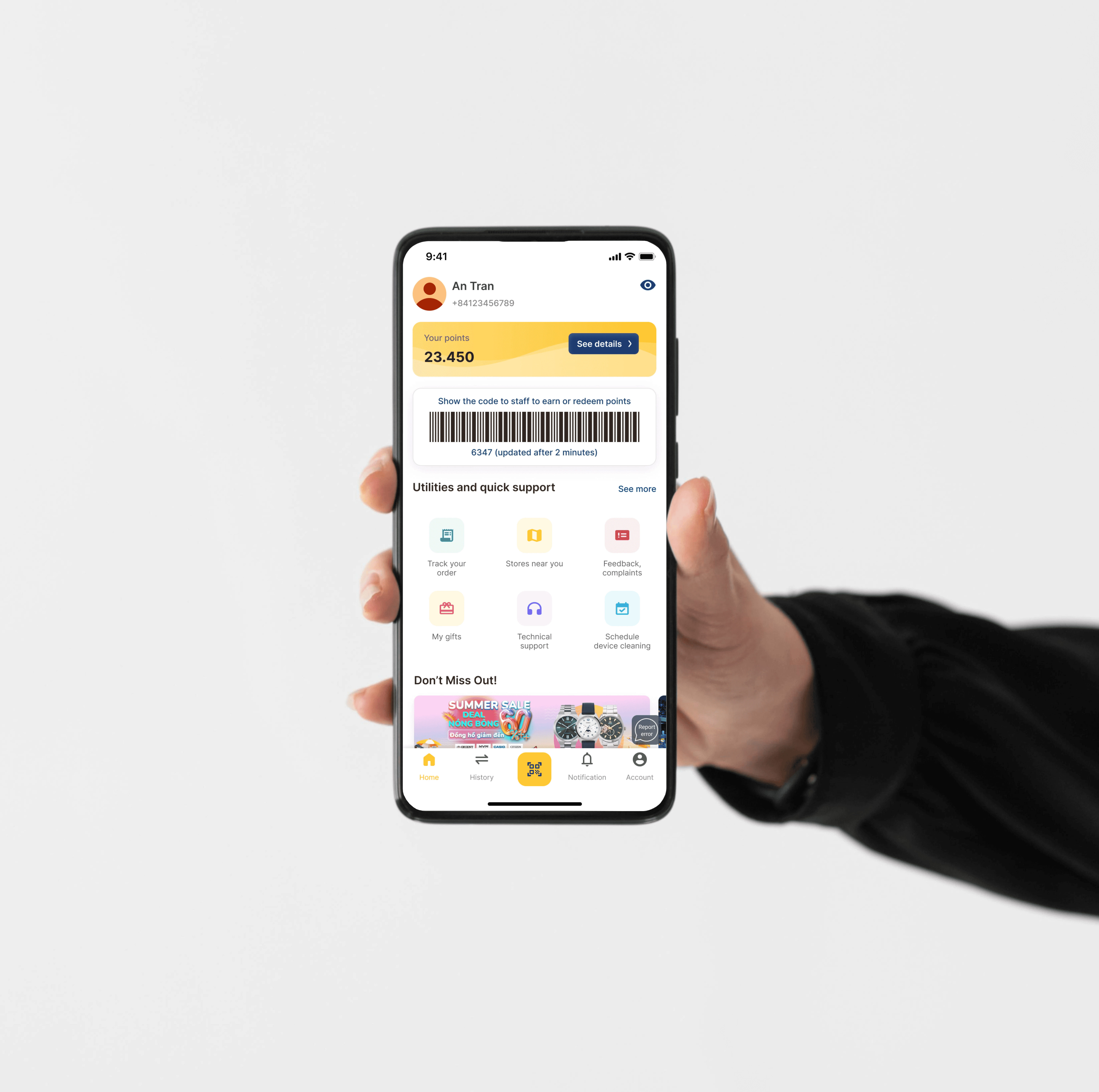
OPTIMIZED HOMEPAGE LAYOUT
The optimized homepage now features a more streamlined top bar with increased privacy, while adding a "Stores Near You" button for quick access. Additionally, banners have been categorized by brands for easier access, making it easier to find relevant offers.
PREVIOUS SOLUTION
The old design had an unintuitive top bar. Users had to go through many steps to find "Stores Near You" and locate brand-specific promotions, increasing confusion.
Ads Strategy & Privacy

Meso
CLEAR POINT ACCUMULATION INFORMATION
By clicking the 'See details' button of the top bar with users' points displayed, the user can see a detailed page about point accumulation categorized by brands, with each brand having specific rules. A new "How to Earn Points" and "Points History" buttons have been added, providing transparency on earning and tracking points.
PREVIOUS SOLUTION
Users struggle to understand how points are accumulated and what benefits they can receive. The point accumulation details are buried within cluttered promotional banners, making it difficult to find and understand the rewards system.
New flow improvements: helping users easily find point policies across brands so they can gain greater control over their reward decisions

Macro
TIERED LOYALTY PROGRAM
Customers can advance from Silver to Platinum status by reaching specific spending milestones, with each tier offering increasing benefits such as exclusive offers from stores within the MWG network. As customers move up the tiers by making frequent purchases, they unlock more valuable rewards and privileges.
OPPORTUNITY
By introducing a tiered loyalty program across the MWG ecosystem, we can directly address the business goal of improving MAU. Competitors already offer loyalty programs, and users have mentioned their interest in such features. Since we currently do not provide this, it presents a clear opportunity to enhance long-term user retention and brand partnerships through rewards and exclusive benefits.
How would this macro approach retain users? Let's imagine …

So what?
To measure success post-launch, I established a three-tiered tracking system
⎯⎯⎯
Metric #1: Click-through Rate
To assess usability at the interaction level.
Metric #2: Monthly Active Users (MAU) Rate
To evaluate user growth at a product level, based on my hypothesis that improved usability will correlate with increased user engagement.
Metric #3: Customer Support Requests
While the other two are direct measurements, this one is an indirect one that aims to understand friction points in the user experience.
After one and a half month, I…
Reflect back on the progress and learn
⎯⎯⎯
Designing with users and business in mind
During a short sprint, I learned to approach design decisions from multiple perspectives, including user experience, business goals, and technical feasibility. This holistic approach ensures that the product addresses user needs and aligns with broader business objectives and market positioning.
Applying 3M framework for product strategy proposal
The most valuable insight I gained is how to propose impactful UX solutions across three levels: Micro, Meso, and Macro (3M framework). One critical lesson I’ve learned is that increasing clarity and reducing risk as much as possible should be prioritized when dealing with ambiguity. This often involves breaking down complex problems through primary research and idea validation to guide effective decision-making.
Conducting effective UX research
Establishing clear goals and methodologies in a research plan is essential for effectively synthesizing findings and ensuring that insights align with the research purpose. By conducting pilot sessions with the team before engaging with real users, I learned to refine the right questions to ask and develop an unbiased question order that encourages genuine responses from users.
